Dash applications need a lot of work to make them look good. Here’s a few ‘how to’ extras that can help out
Latex in Markdown
The latest release of Dash made it much easier to add Latex to your markdown elements. Here’s an example:
dcc.Markdown(children="""
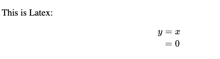
This is Latex:
$$
\\begin{align}
y &= x \\\\
&= 0
\\end{align}
$$
""", mathjax=True)Which gives us:
\[ \begin{align} y &= x \\ &= 0 \end{align} \]
There were only two tricky bits now: you must set the mathjax=True in order to enable it, and you need to add an extra backslash (i.e. becomes \\).
This is just an artifact of how it’s rendering escape characters.
Add Custom Google Fonts
You can use CSS for everything in your Dash app except for the charts that Plotly generates. So, adding in Google fonts is relatively straightforward - you can either follow the @import instructions add a new css file to your /assets/ folder or you can add it in as an external stylesheet.
- Load it in to assets:
# \assets\fonts.css
@import url('https://fonts.googleapis.com/css2?family=Press+Start+2P&display=swap');

body {
    font-family: 'Press Start 2P';
}- Add it as an external stylesheet
from dash import Dash, html

external_stylesheets = [
    "https://fonts.googleapis.com/css2?family=Press+Start+2P&display=swap"
]

app = Dash(__name__, external_stylesheets=external_stylesheets)

app.layout = html.Div([
    # Title
    html.H1(children="Dashboard Title", id="db-name",
            style={"font-family": "'Press Start 2P'"}),
])

if __name__ == '__main__':
    app.run_server(debug=True)
Always use hovermode='x unified' for Line Charts
For line charts (I deal with a lot of time series) I always set the hovermode to x unified to allow for line vs line comparisons, and round the decimals to 2 places:
fig.update_layout(hovermode='x unified')You’ll also likely need to round down the hover text as well (see hover text and formatting)
go.Bar(df, x='col1', y='col2', hover_data={'col1':':.2f', 'col2':':.2f'})Move that legend to the bottom
The default Plotly legend is to the right, and on some screens this can steal all the plot real estate. Move the legend to the bottom with this snippet:
fig.update_layout(legend=dict(yanchor='bottom',
                              y=-.5,
                              xanchor='auto',
                              x=.5))
Adjust the y position as needed to clear the xaxis label.
Remove redundant annotations and labels on facet plots
One downside with using facet_row or facet_col is that plotly will add axis labels for each row or column that make things look messy. For example, if you use facet_row='category' each faceted plot will have an annoying category=blah repeated across all of your plots.
Usually we just want to keep the part after the = sign, so we can fix that with:
def clean_annotations(fig):
  """Removes the annoying 'Feature=' label that clutters plotly graphs when you do facet_row or facet_col"""
  fig.for_each_annotation(lambda a: a.update(text=a.text.split("=")[1]))
  return fig