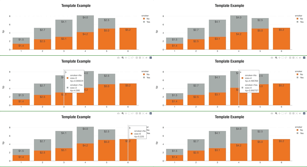
I got a little lost reading the plotly docs on saving a custom plotly template, so here’s a basic skeleton of a template inspired by Nike’s 10K that you can use to customize basic plot colors, fonts, and show you how the template is structured. I also structured the code to be a little more readible for me since I didn’t like their use of both dict and their ‘magic underscore notation’ which made things more confusing. When you make a template IRL they are going to be pretty verbose and magic underscore notation is not helpful.
Here’s the example. Oh, and you should save it as a file like my_template.py so you can share it as an internal package that people can install with pip or something:
my_template.py:
import plotly.graph_objects as go
import plotly.io as pio

pio.templates["nike"] = go.layout.Template(
    # LAYOUT
    layout = {
        # Fonts
        # Note - 'family' must be a single string, NOT a list or dict!
        'title':
            {'font': {'family': 'HelveticaNeue-CondensedBold, Helvetica, Sans-serif',
                      'size':30,
                      'color': '#333'}
            },
        'font': {'family': 'Helvetica Neue, Helvetica, Sans-serif',
                      'size':16,
                      'color': '#333'},
        # Colorways
        'colorway': ['#ec7424', '#a4abab'],
        # Keep adding others as needed below
        'hovermode': 'x unified'
    },
    # DATA
    data = {
        # Each graph object must be in a tuple or list for each trace
        'bar': [go.Bar(texttemplate = '%{value:$.2s}',
                       textposition='outside',
                       textfont={'family': 'Helvetica Neue, Helvetica, Sans-serif',
                                 'size': 20,
                                 'color': '#FFFFFF'
                                 })]
    }
)
Layout: Choose Fonts and Colors
The first thing I do when building out a template layout is I get inspiration from a company’s 10k/10Q financial filings and their branding to get their fonts and colors. Google ‘(company name) investor relations’ and that’ll take you to a site where they have a bunch of their financial statements and letters to shareholders and such.
Fonts:
- Either take a screenshot of the font and run it through a font identifier like FontSquirrell’s matcherator (hit or miss)
- Open their site in Chrome, highlight the font text and then hit ‘inspect’ to get the Styles for
font-family, etc.
Colors: I will take a screenshot and run it through a color picker site like imagecolorpicker.com that will try to get the hex codes ordered from left to right based on the proportion of the color in the image. These would then go to your
colorwayas items in a list in a similar order.- Alternatively, here’s a great article on How to make a color palette from 1 color or this shorter article from Kaggle
There’s a ton of other options to choose from in the layout section, check the official layout Docs.
Data: Add chart-specific styling
The data property is used for specific plotly.graph_objects styling, like for bar charts and stuff.
For the full list of options for each item in the ‘data’ property, you’ll need to read the plotly documentation for each graph object (i.e. for bar plots look up graph_objects.bar) and go from there.
Protip: Practice with built-in Plotly datasets
Plotly has a bunch of built-in datasets that you should practice with when building POC’s, but the list is hard to find. Here’s the API reference.
Finished Example:
import plotly.express as px
import my_template # Import your template here

# load demo data
from plotly.data import tips
df = tips()
df = df[['smoker', 'size', 'tip']].groupby(by=['smoker', 'size'], as_index=False).mean()

# Plot with the new template
fig = px.bar(df, x='size', y='tip', color='smoker',
             template='nike', title='Template Example')
fig.show()
Tested on Plotly 4.14.3
Reference: