It’s December 2020 and it’s time to check out different python plotting packages. I primarily will use pandas dataframe plotting with either seaborn’s sns.set() or setting plotly as the plotting backend during data exploration, but there’s nothing in python that matches R’s ggplot2. I’ve known about plotnine as the python equivalent but last time I tried it it was still lacking in the feature department. I’m happy to say that it’s totally viable now.
One chart that I often used in R was a ‘tie fighter’ (error bar) chart. It’s handy to compare accuracy for various predictive models. Here’s a motivating example from ‘thecodeforest’ where he compares various time serious forecasting models in R. I’m also motivated to stick with ggplot because then I’d be able to quickly make plots in R, python, and in Julia (given how seamless RCall is in Julia and native support of dataframes).
Plotnine
Here’s what the syntax for a quick tie fighter chart in plotnine using the included mtcars dataset as a toy example:
from plotnine import *
from plotnine.data import mtcars
import pandas as pd
import numpy as np
from scipy.stats import sem

# Calc mean, std error of mpg by number of cylinders and whether they're automatic (0) or manual (1)
df = mtcars.groupby(['cyl', 'am'])['mpg'].agg([np.mean, sem]).reset_index()

p = (ggplot(df, aes('factor(cyl)', 'mean', color='factor(am)'))
+ geom_point()
+ geom_errorbar(aes(ymin = 'mean - sem', ymax = 'mean + sem'))
+ coord_flip()
+ labs(title="A Tie Fighter Chart",
        x = 'Cylinders',
        y = 'Mean MPG +/-1 SE')
)

p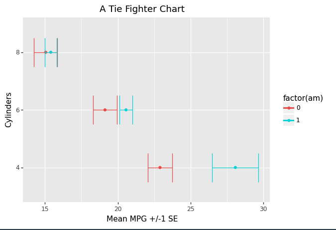
And what I love about ggplot2 (and plotnine) is the consistent syntax and how easy it is to add or remove customization and complexity compared to the other plotting libraries in python:
# Now it's trivial to add or remove stuff to our plots, even in python!
p + theme(xkcd)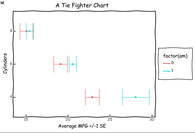
One thing we’re still missing is the ability to do subtitles and captions, but maybe someday.
Altair
Altair is another opinionated plotting package based on Vega-lite that has a very consistent syntax that’s worth a look.
Here’s the same example as above, but in Altair:
import altair as alt
from plotnine.data import mtcars

points = alt.Chart(mtcars).mark_point().encode(
    x='average(mpg):Q',
    y='cyl:O',
    color='am:N',
).properties(height=200)

error_bars = alt.Chart(mtcars).mark_errorbar(extent='stderr', ticks=True).encode(
  x=alt.X('average(mpg):Q', scale=alt.Scale(zero=False)),
  y=alt.Y('cyl:O'),
  color='am:N',
)

points+error_bars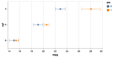
Notice that Altair has baked in aggregation and transformations so I didn’t have to do my groupby and agg in pandas. And similar to what I like in ggplot2/plotnine there’s the ability to quickly add and remove complexity. But as you can see the result was so small on my macbook pro, and I wish there was an easy way to scale the whole thing up to a reasonable aspect ratio (looks like I’d have to scale up each component separately or save as SVG).