Inspired by the FiscalData.treasury.gov website, I set out to create a clean-looking line chart template that I can insert either as a tooltip or directly into a KPI card.
Example: 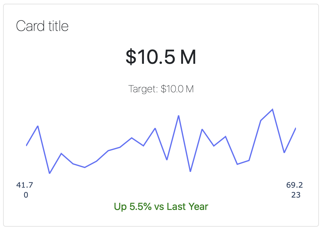
Here’s the code for the figure, using some dummy random data:
import numpy as np
import plotly.express as px

np.random.seed(1)
x = np.arange(len(y))
y = np.random.random_sample(24) * 100

fig = px.line(x, y)
xmin = x[0]
xmax = x[-1]
ymin = round(y[0], 1)
ymax = round(y[-1], 1)

layout = {
    "plot_bgcolor": "rgba(0, 0, 0, 0)",
    "paper_bgcolor": "rgba(0, 0, 0, 0)",
    "yaxis": {"visible": False},
    "xaxis": {
        "nticks": 2,
        "tickmode": "array",
        "tickvals": [xmin, xmax],
        "ticktext": [f"{ymin} <br> {xmin}", f"{ymax} <br> {xmax}"],
        "title_text": None
        },
    "showlegend": False,
    "margin": {"l":4,"r":4,"t":0, "b":0, "pad": 4}
}
config = {'displayModeBar': False}

fig.update_layout(layout)
# fig.show(config = config)
# dcc.Graph(figure=fig, config = config)
I like having the layout as a dictionary so we can reuse it if we end up using a bunch of these.
Breaking down the layout
Hide the plot background:
    "plot_bgcolor": "rgba(0, 0, 0, 0)",
    "paper_bgcolor": "rgba(0, 0, 0, 0)",
Hide the y-axis entirely:
"yaxis": {"visible": False},For the x-axis, show only the first and last ticks, and set the tick text to have that 2-level effect, and hide the x-axis title.
    "xaxis": {
        "nticks": 2,
        "tickmode": "array",
        "tickvals": [xmin, xmax],
        "ticktext": [f"{ymin} <br> {xmin}", f"{ymax} <br> {xmax}"],
        "title_text": None
        },
And finally, hide the legend and clean up the margins to reduce whitespace in the card. If you don’t do this it makes for a really small plot.
    "showlegend": False,
    "margin": {"l":4,"r":4,"t":0, "b":0, "pad": 4}
We also need to set up the config to hide the annoying modebar, and this goes either in the fig.show() call or the dcc.Graph() call, depending if you’re just using Plotly or using this in Dash.
config = {'displayModeBar': False}And here’s the code for the card:
card = dbc.Card(
    [
        dbc.CardBody(
            [
                html.H4("Card title", className="card-title"),
                html.P(
                    "$10.5 M",
                    className="card-value",
                ),
                html.P(
                    "Target: $10.0 M",
                    className="card-target",
                ),
                dcc.Graph(figure=fig, config=config),
                html.Span(
                    "Up ",
                    className="card-diff-up",
                ),
                html.Span(
                    "5.5% vs Last Year",
                    className="card-diff-up",
                ),

            ]
        ),
    ],
)